GnuDraw Graphics Tips & Tricks
Contents:
- Daily time series
- Adjust x-area in time series
- Multiple colors indicated
- Drawing arrows
- Filling a region
- Contour plot with label
- Smooth transition of colors
- Draw Cdf
[Top]
Daily time series
Gnudraw can easily handle daily time series, plotting them as in OxDraw using
DrawXMatrix(0, vY, "y", vDates, "time");
// DrawAxisAuto(0, 1); // In GnuDraw, time can only be put on X-axis
DrawAdjust(ADJ_AXISSCALE, AXIS_DATE);
where vDates is a vector of dayofcalendar() dates. As
GnuDraw can only plot time on the X-axis, it is not necessary to select
the axis with a DrawAxisAuto statement.
A similar effect can be obtained using
DrawTMatrix(0, vY, "y", vDates, 0, 0);
where no call to DrawAdjust is necessary.
The format on the axis can
be changed using a DrawAdjust
command, as in
DrawAdjust(ADJ_AXISFORMAT, " %m/%y", TRUE);
DrawAdjust(ADJ_AXISFORMAT, " %d/%m", TRUE);
Note the space in the axis format to distinguish this axis format from
the Ox formatting sequence.
The formatting string can indicate
- %Y: Year yyyy
- %y: Year yy
- %m: Month
- %d: Day
- %H: Hour
- %M: Minute
- %S: Second
The tics on the axis can be adapted using DrawAxis. E.g.
DrawAxis(0, 1, M_NAN, M_NAN, M_NAN, M_NAN, 1, .25, 1);
adapts area 0, the X-axis (iIsXaxis= 1), with tics on the border without a zero axis
(dAnchor= M_NAN), not specifying either the axis minimum, maximum, or
first large tick, to have one (dLargeStep= 1) large tick per year, a small tick
every quarter (dSmallStep= .25), and specifying things in a
yearly frequency (iFreq= 1).
See ../tips/timeseries.ox and
../tips/intradaily.ox for
two examples.
[Top]
Adjusting the x-area of time series plot
As the time series plot can be seen as a xy-plot with special X-axis,
the region of the x-area can be adjusted specifying the dayofcalendar() as lower
or upper limit:
DrawAdjust(ADJ_AREA_X, iArea, dayofcalendar(1989, 1, 1), dayofcalendar(2003, 1, 1));
The specifying the time-of-day along with the date is possible by
handing the fraction, as given by the timeofday() function.
See ../tips/timeseries.ox for
an example.
[Top]
Multiple colors indicated
With GnuDraw multiple colors for multiple lines can be indicated in the
drawing commands, as in
mX= rann(100, 50);
mQ= quantilec(mX, <.25, .5, .75>);
DrawMatrix(0, mQ, {"Q25", "Q5", "Q75"}, 1, 1, 0, <3, 2, 3>);
This results in quantiles in green, and the median in red.
[Top]
Drawing arrows
Draw an arrow in GnuPlot by using a negative color number in DrawLine, as in
// DrawLine with negative color index draws an arrow
DrawLine(0, 0, 0, 1, 1, -1);
[Top]
Filling a region
A region underneath a graph can be filled using crosses etc in a rough
way using
DrawXMatrix(0, vY, "y", vX, "x", 0, 2);
DrawXMatrix(0, vY, "y", vX, "x", 0, 3); // Repeat plot command
// Adjust line style
DrawAdjust(ADJ_COLOR, 3, TP_USER, "boxes fs pattern 1");
This plots the second line using boxes with a fillstyle of pattern 1;
see also plot5-e.html
or the general Gnuplot manual for the usage of the fillstyle with boxes.
Another use of DrawAdjust(ADJ_COLOR,
TP_USER, ...) is
DrawXMatrix(0, vY, "impulses", vX, "", 3, 2);
Instead of using a user-defined line-type, DrawAdjust can also fill a
region, as in
DrawXMatrix(1, 0~vY~0, "filledcurves, closed region",
min(vX)~vX~max(vX), "", 0, 3);
DrawAdjust(ADJ_FILLCURVE);
which fills the region enclosed by the curve with a solid
color 3. Alternatively, to take the region between the curve and the
x-axis, use
DrawXMatrix(0, vY, "filledcurves to x-axis", vX, "", 0, 3);
DrawAdjust(ADJ_FILLCURVE, 1);
One can also specify until what height the plot should be filled, with
DrawXMatrix(0, vY, "filledcurves to y=0.1", vX, "", 0, 3);
DrawAdjust(ADJ_FILLCURVE, 0, 0.1);
These filled curves can be convenient to indicate e.g. recession
periods. Assume that vNBER is a vector with indices for
recessions, then
iMin= floor(min(vY));
iMax= ceil(max(vY));
DrawTMatrix(0, vNBER .? iMax .: M_NAN, "", vTime, 0, 0, 0, 5);
DrawAdjust(ADJ_FILLCURVE, 0, iMin);
DrawTMatrix(0, vY, "y", vTime, 0, 0);
provides a plot with shaded regions between iMin and
iMax for those periods.
See ../tips/fill.ox and
../tips/nber.ox for
examples displaying the differences, with output as in
../tips/graphs/fill.png and
../tips/graphs/nber.png.
[Top]
Contour plot with label
The standard way of drawing labels along the axes of a contour plot can
take up too much space. Sometimes it is useful to indicate the type of
variable within the space of the graph. The DrawText(...) can be handy here.
Compare the outcome of
DrawBivDensity(0, rann(2, 1000), {"a", "b"}, 1, 0, 0, 2);
DrawBivDensity(1, rann(2, 1000), "", 1, 0, 0, 2);
// Draw a label within the surface, at the upper right corner, right
// aligned. The z-coordinate of 0 places the label at the bottom, though
// you cannot see it in a contour plot.
DrawText(1, "a x b", .99, .99, 0, 0, 0, 0, 1, 0, "right");
See ../tips/contour_label.ox for
an example.
[Top]
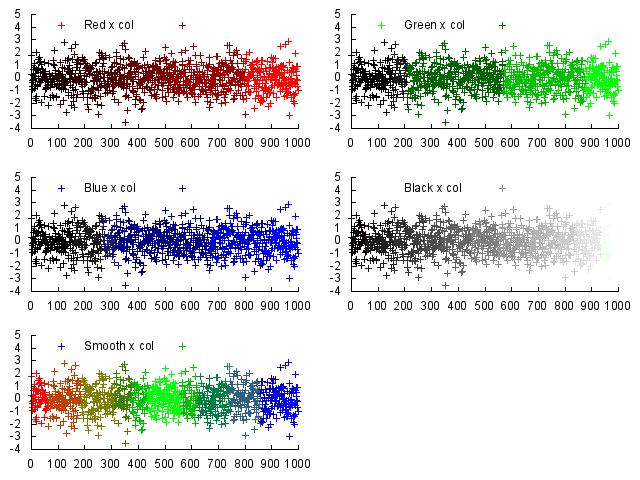
Smooth transition of colors
The DrawZ() function can be used to
have the change the colors of individual points in a line.
A basic example would be to plot
Draw(0, rann(1, 256));
DrawZ(range(0, 255), "", ZMODE_COLOR);
which would result in a plot with colors moving from dark blue to white.
The color value is specified as a number between 0 and 2^24-1, or in
hexadecimal notation between 0x000000 and 0xFFFFFF. The
three bytes in the number govern the intensities of red, green and blue in
the color.
See ../tips/scatcol.ox for
an example, including a function rgbN(const iN) which leads to
smoothly changing colors from red to blue, as in the last panel in
../tips/graphs/scatcol.png. Note however that
not every output format is able to show all distinct colors.
[Top]
DrawCdf
A new function function DrawCdf()
allows to draw a cumulative distribution function (as in DrawDensity()), annotating the
graph with a box to indicate the 5, 50 and 95% quantiles of the
variable, and possibly the original value of the DGP.
Usage is simple a call like
mX= ranchi(1, 10000, 5);
DrawCdf(0, mX, "Chi2(5)", 5, <.05, .5, .95>, 2);
which would plot the CDF, with boxes indicating the quantiles, in the
color 2. A dotted cross would indicate the true mean, 5 in this case.
See ../tips/graphs/drawcdf.png for the output from
../tips/drawcdf.ox.
[Top]
GnuDraw version 7.0.
Changes made on 18-May-2015 for including GnuDraw Tips
& Tricks by
CS Bos